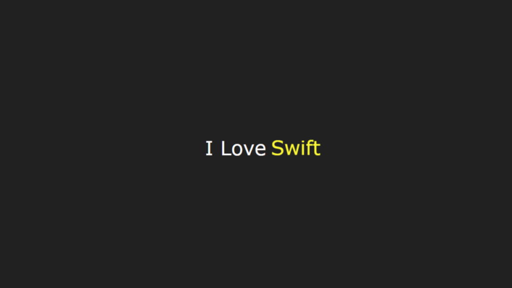
Code Preview
I Love
Animated Text Loader Using HTML and CSS
Introduction
Creating visually appealing loaders can significantly enhance user experience on a website. A great example is an animated text loader, which not only captures attention but also conveys a message in an engaging way. In this blog, we’ll discuss how to create a simple yet elegant animated text loader using HTML and CSS. The code provided demonstrates an animation that transitions between different words, perfect for a landing page or an “under construction” section.
Below Is Complete Code For This:
					<!DOCTYPE html>
<html lang="en">

<head>
    <meta charset="UTF-8">
    <meta name="viewport" content="width=device-width, initial-scale=1.0">
    <title>Animated Text Loader By code.bpers.com</title>
    <style>
        /* Global Styles By Code.bpers.com */
        * {
            padding: 0;
            margin: 0;
            box-sizing: border-box;
            font-family: Verdana, Geneva, Tahoma, sans-serif;
        }

        body {
            background-color: #212121;
        }

        /* Loader Styles */
        .loader-wrapper {
            display: flex;
            justify-content: center;
            align-items: center;
            height: 100vh; /* Ensures it centers the loader vertically and horizontally */
        }

        .loader {
            color: rgb(254, 252, 252);
            font-family: "Poppins", sans-serif;
            font-weight: 500;
            font-size: 25px;
            display: flex;
            border-radius: 8px;
        }

        .words {
            overflow: hidden;
            position: relative;
        }

        .word {
            display: block;
            height: 100%;
            padding-left: 6px;
            color: #00d4fa;
            animation: animate 4s infinite;
        }

        /* Keyframes Animation By code.bpers.com */
        @keyframes animate {
            10% {
                transform: translateY(-102%);
            }

            25% {
                transform: translateY(-100%);
            }

            35% {
                transform: translateY(-202%);
            }

            50% {
                transform: translateY(-200%);
            }

            60% {
                transform: translateY(-302%);
            }

            75% {
                transform: translateY(-300%);
            }

            85% {
                transform: translateY(-402%);
            }

            100% {
                transform: translateY(-400%);
            }
        }
    </style>
</head>

<body>
    <div class="loader-wrapper">
        <div class="loader">
            <p>I Love</p>
            <div class="words">
                <span class="word">Python</span>
                <span class="word">Java</span>
                <span class="word">Swift</span>
                <span class="word">JavaScript</span>
                <span class="word">Php</span>
            </div>
        </div>
    </div>
</body>

</html>
Explanation
1. HTML Structure
The HTML is minimal and comprises two main parts:
-
A
<div>container with the classloader-wrapperthat centers the content vertically and horizontally. -
Nested within the wrapper, the
loaderdiv contains a static phrase (I Love) and awordscontainer that holds the animated words.
2. CSS Styling
-
Global Styles: Resets margins and paddings, ensures box-sizing consistency, and applies a dark background to the body.
-
Loader Styling: The loader is styled with a clean font, rounded corners, and a modern color scheme.
-
Animation: The
@keyframesrule animates thetranslateYproperty, creating the sliding effect. Each word transitions in and out of view sequentially.
3. Animation Logic
The animation is set to cycle every 4 seconds (animation: animate 4s infinite;). Each span.word is displayed in turn by adjusting its position through translateY. The overflow: hidden property ensures only one word is visible at a time.
Customization Tips
Here are some ways to personalize the loader:
-
Add More Words: To add new words, simply include additional
<span class="word">NewWord</span>elements inside thewordsdiv. -
Adjust Animation Speed: Modify the
4svalue in theanimationproperty to control the speed of the transitions. -
Change Colors: Update the
colorproperties to match your website’s theme. -
Font Styling: Experiment with different font families and sizes for a unique look.
Use Cases
-
Landing Pages: Engage visitors while the main content loads.
-
Maintenance Pages: Replace “Coming Soon” messages with an animated loader.
-
Web Apps: Indicate processing times in a creative way.
Conclusion
This animated text loader is a simple, efficient way to enhance user experience with minimal code. With CSS-only animations, there’s no need for JavaScript, making it lightweight and easy to integrate. Try it out on your next project and watch as it adds a modern, dynamic touch to your website!