Code preview
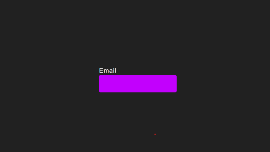
Email
This page features a simple and elegant input box for entering an email address. The design is clean and minimalistic, focusing on providing a user-friendly experience.
Structure of the Page:
- Input Box: The main element is an input box where users can type their email address. It has a modern design with a subtle effect when the user interacts with it. As soon as the user starts typing, the placeholder text smoothly moves above the input field.
- Label for Input: Next to the input field, the label displays the word “Email” in black. This is the prompt that indicates what information the user should enter. The text is placed inside the input box initially, but as the user types, it transitions above the box.
- Highlight Effect: There’s an underline effect that appears beneath the input box. It starts off as a thin line that expands as the user focuses on the input field. This adds a dynamic and engaging touch to the design.
- Responsive Design: The layout is fully responsive, which means it will adjust nicely on different screen sizes, making it user-friendly on mobile devices, tablets, or desktops.
Styling Details:
- Input Field: The input box is transparent with white text. When the user starts typing or focuses on the input field, the label text (“Email”) smoothly transitions upwards and becomes smaller, making room for the user to enter their email.
- Hover and Focus Effects: When the user interacts with the field, the label moves, and the bottom underline expands, giving a visually appealing effect. This feedback helps guide the user as they complete their input.
- Background and Color: The background of the page is a dark shade of gray (#212121), which contrasts nicely with the white input text and the black label, making it easier on the eyes. The underlining effect is a vibrant purple (#c200fd), which adds a pop of color, creating a modern aesthetic.
- Typography: The font is simple, clean, and readable. The text is in white by default, except for the “Email” label, which is black, giving a contrast between the placeholder text and the actual label.
Why It Works Well:
- Simplicity and Clarity: This page is designed to focus solely on one element: the email input field. There’s no clutter or distractions. It’s easy for the user to understand and interact with. The straightforward design makes it ideal for forms, login pages, or any situation where you need to collect an email address.
- Elegant Interactions: The small animations and transitions make the form feel alive, adding a touch of elegance to the user experience. The underline effect and smooth movement of the label are subtle but make the page feel modern and engaging.
- Clean, Professional Look: The color palette is very well-balanced. The dark background contrasts with the white text, and the black label stands out enough to be easily readable. The subtle purple underline adds a professional yet slightly playful touch to the design.
Conclusion:
In short, this page is an excellent example of how minimalism and usability can come together to create an effective and visually appealing user experience. The form is simple but features small details that enhance the user’s interaction with the page. It’s great for any kind of form where you need to collect an email address in a clean and efficient way.
HTML:
<!DOCTYPE html>
<html lang="en">

<head>
    <meta charset="UTF-8">
    <meta name="viewport" content="width=device-width, initial-scale=1.0">
    <meta http-equiv="X-UA-Compatible" content="ie=edge">
    <title></title>
    <link rel="stylesheet" href="style.css">
</head>

<body>
    <div class="inputbox">
        <input type="text" required="required">
        <span>Email</span>
        <i></i>
    </div>
</body>

</html>
CSS:
* {
    padding: 0;
    margin: 0;
    box-sizing: border-box;
    font-family: Arial, Helvetica, sans-serif;
}

html,
body {
    display: grid;
    height: 100%;
    place-items: center;
    background-color: #212121;
}

.inputbox {
    position: relative;
    width: 196px;
}

.inputbox input {
    position: relative;
    width: 100%;
    padding: 20px 10px 10px;
    background: transparent;
    outline: none;
    box-shadow: none;
    border: none;
    color: #fff;
    font-size: 1em;
    letter-spacing: 0.05em;
    transition: 0.5s;
    z-index: 10;
}

.inputbox span {
    position: absolute;
    left: 0;
    padding: 20px 10px 10px;
    font-size: 1em;
    color: #8f8f8f;
    letter-spacing: 00.05em;
    transition: 0.5s;
    pointer-events: none;
}

.inputbox i {
    position: absolute;
    left: 0;
    bottom: 0;
    width: 100%;
    height: 2px;
    background: #c200fd;
    border-radius: 4px;
    transition: 0.5s;
    pointer-events: none;
    z-index: 9;
}

.inputbox input:valid~span,
.inputbox input:focus~span {
    color: #fff;
    transform: translateX(-10px) translateY(-36px);
    font-size: 0, 75rem;
}

.inputbox input:valid~i,
.inputbox input:focus~i {
    height: 44px;
}